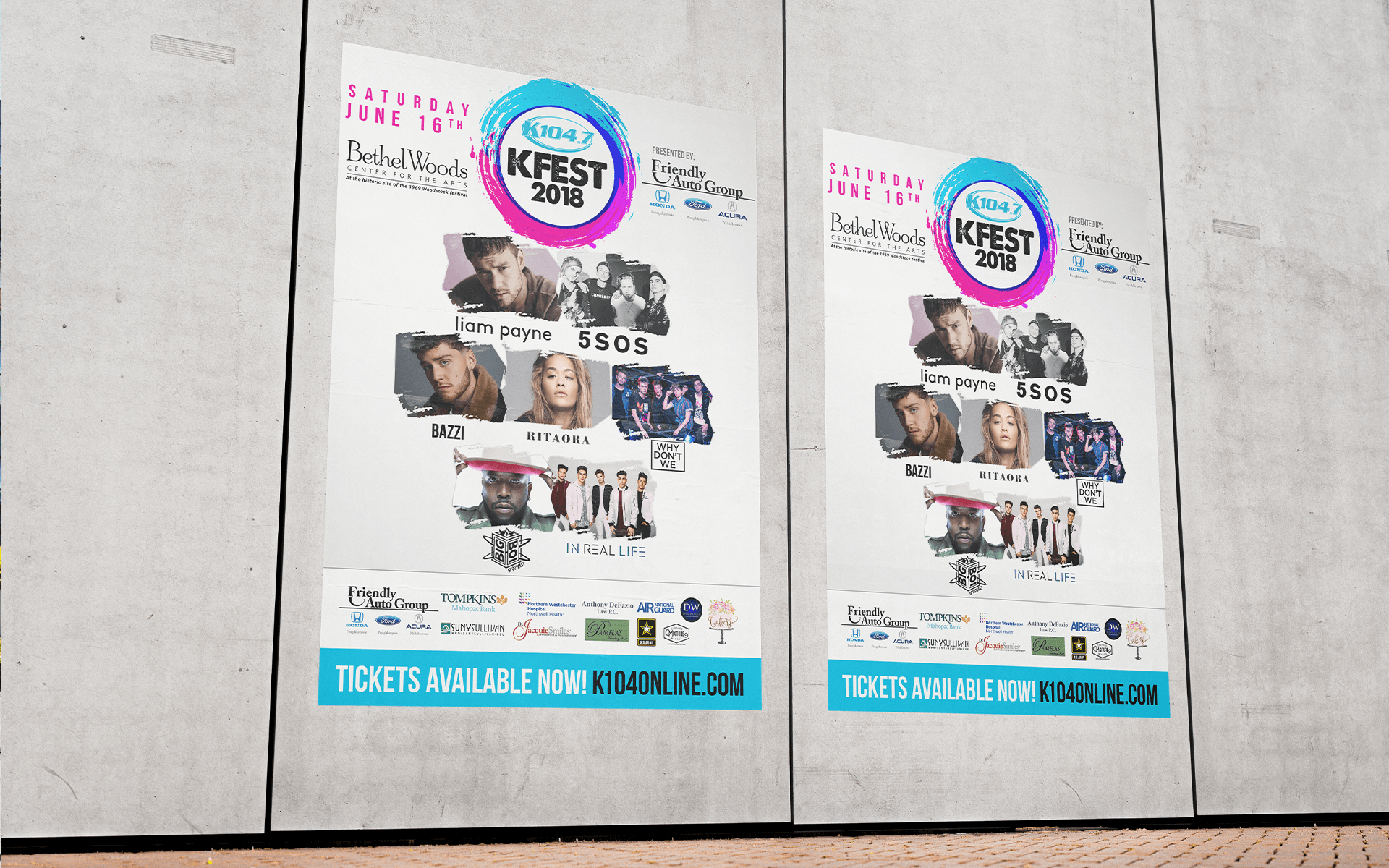
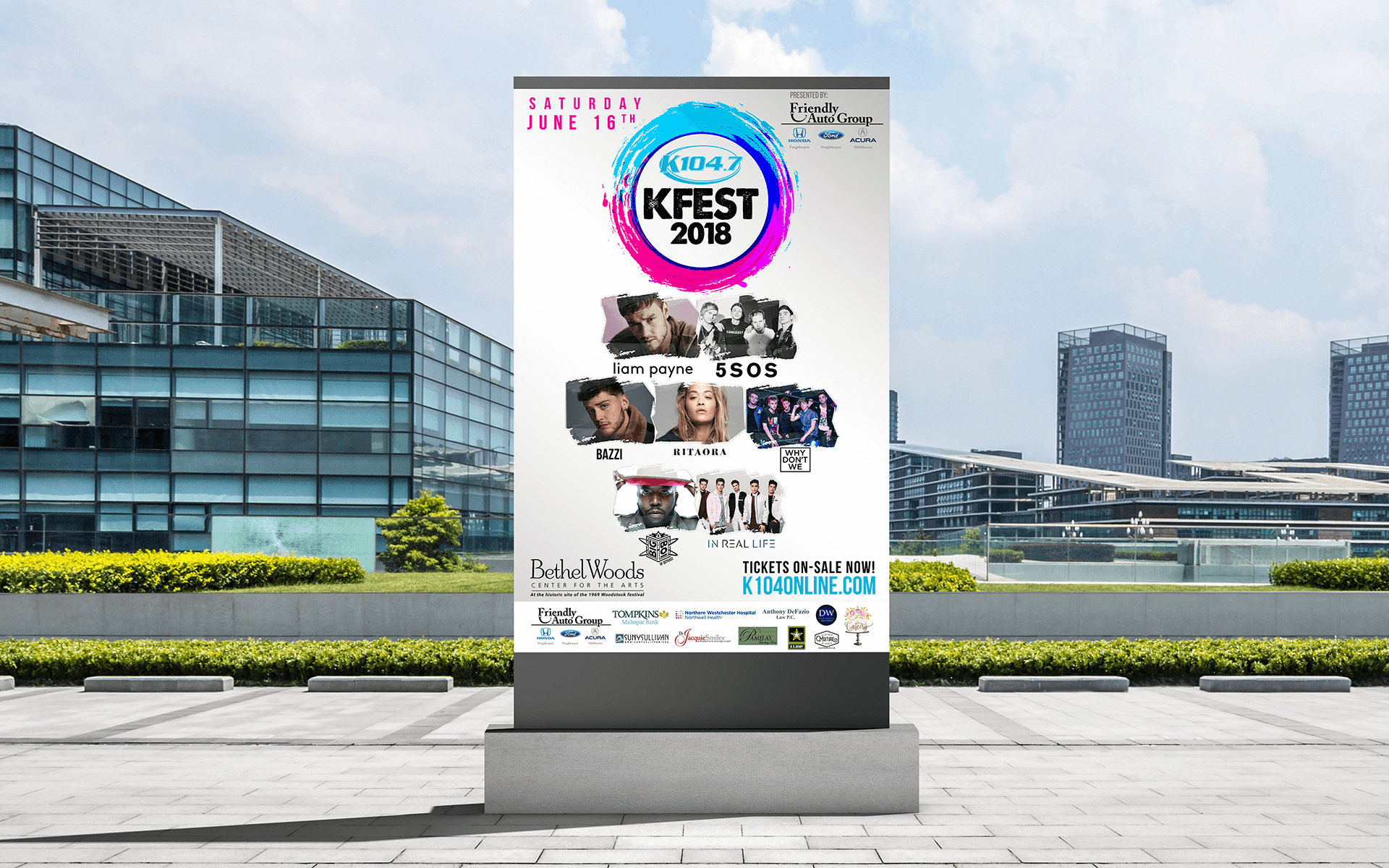
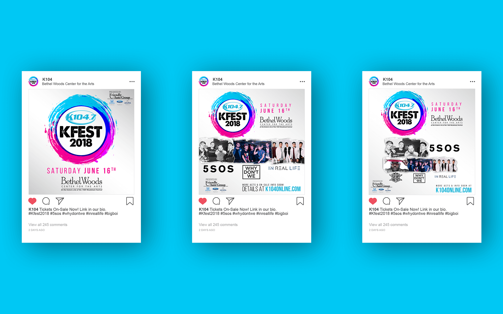
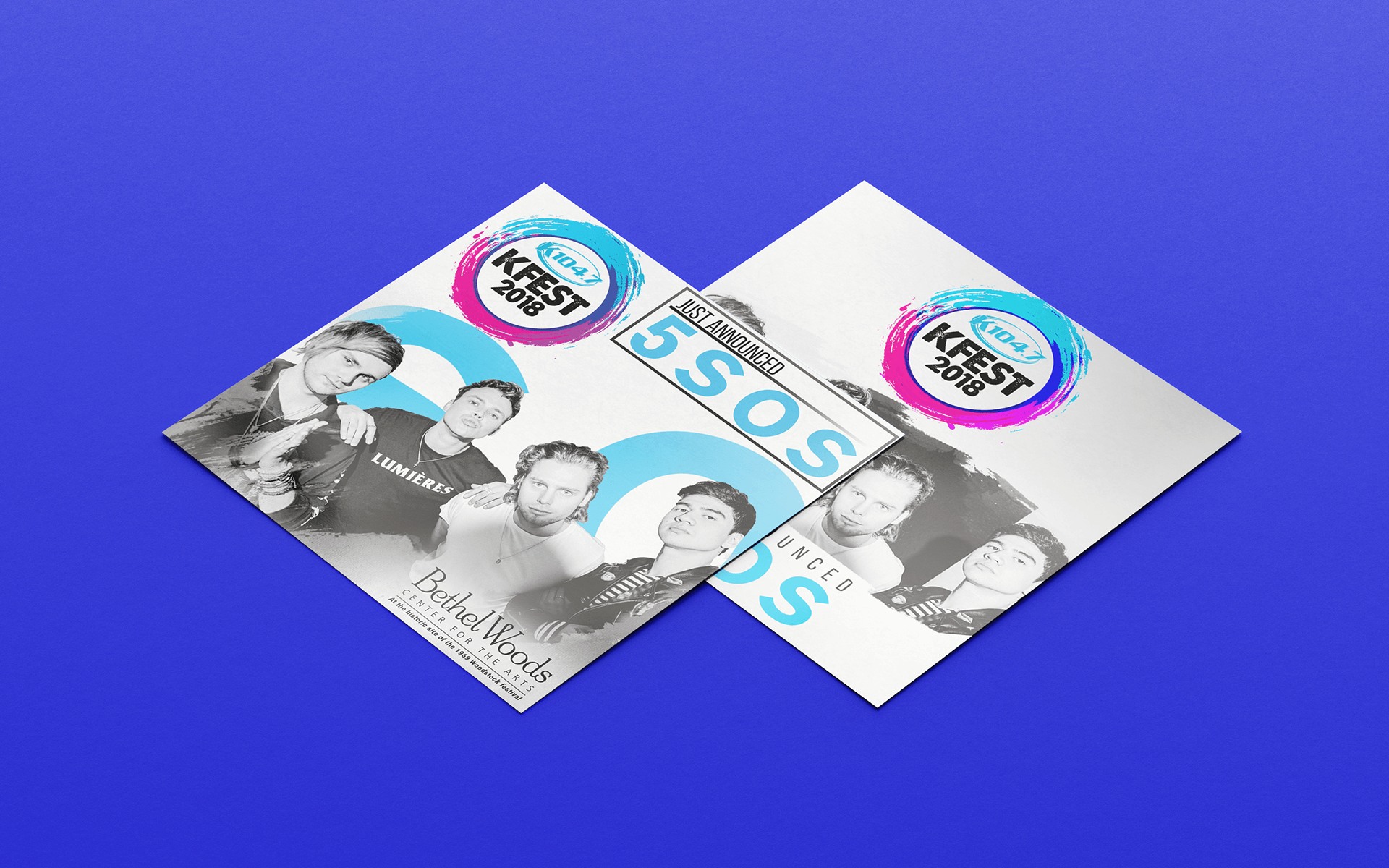
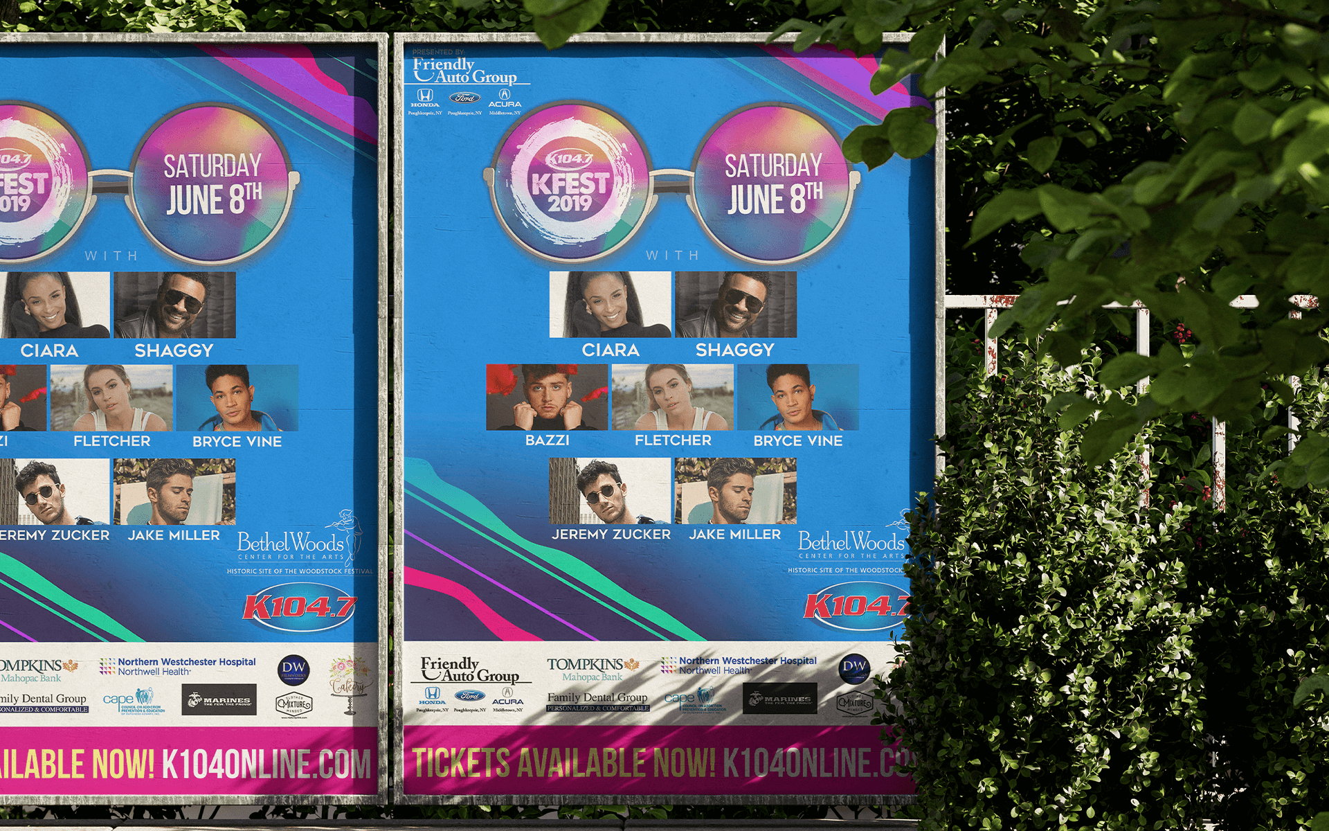
KFest at Bethel Woods - Event Identity
I explored different typographic styles, color palettes, and graphic elements that could convey the festival's energy and create a sense of anticipation. I experimented with bold typography and color to capture the essence of the event. The logo was designed to be mass appeal and to be easily recognizable across all platforms. The color palette was chosen to reflect the vibrant energy & summery vibes of the festival. Using Adobe Creative Suite, I developed a comprehensive brand identity system, including the logo, typography, color palette, and supporting graphics.