Typography - Magazine Spread: 2017 Font Trends
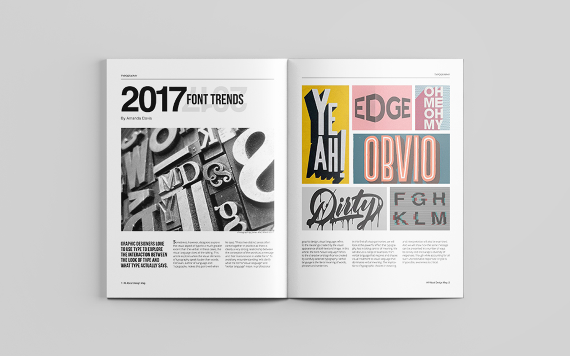
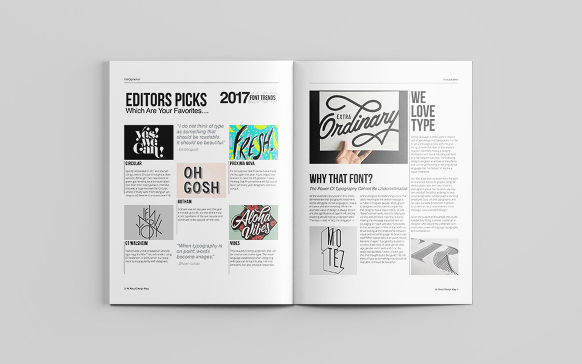
My design process began with extensive research into the popular font trends of 2017. I curated a selection of typefaces that represented the key styles and aesthetics of the year, focusing on playful fonts and their versatility. I then explored how bold color palettes and clean grid layouts could best showcase these fonts. I experimented with different grid structures to create a sense of hierarchy and visual interest. The color palette was chosen to be vibrant and eye-catching, reflecting the boldness of the selected typefaces while also maintaining a sense of balance and harmony. The playful fonts were strategically placed to create a sense of movement and energy across the spread. The clean aesthetic was essential to ensure readability and prevent the design from becoming overwhelming. Using Adobe InDesign, I meticulously crafted the layout and typography, paying close attention to kerning, leading, and alignment to ensure optimal readability and visual appeal.