Typography - Magazine Spread: 2017 Font Trends
Client
Self-Initiated Project
Year
Digital, 2017
Role
Designer
Task
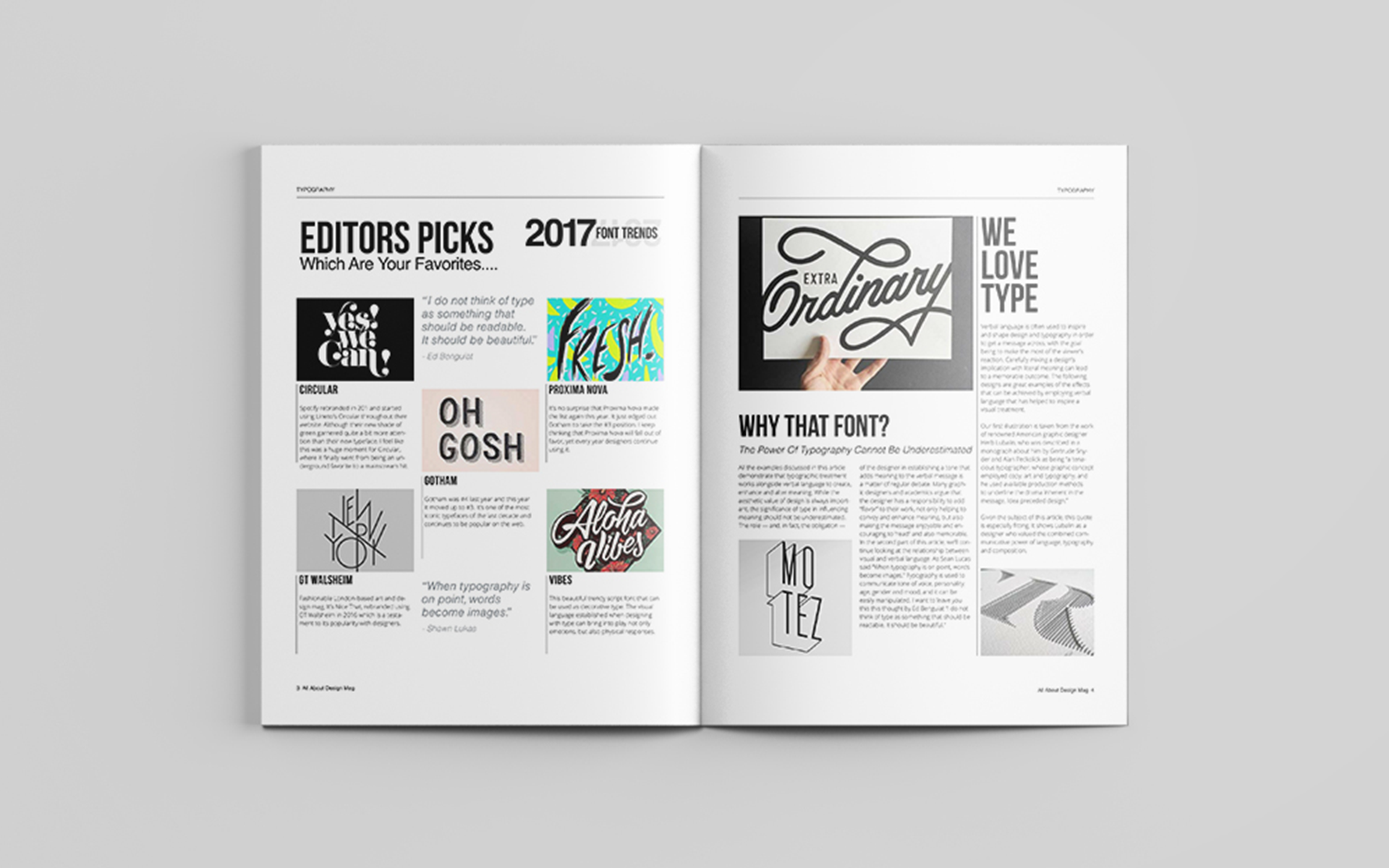
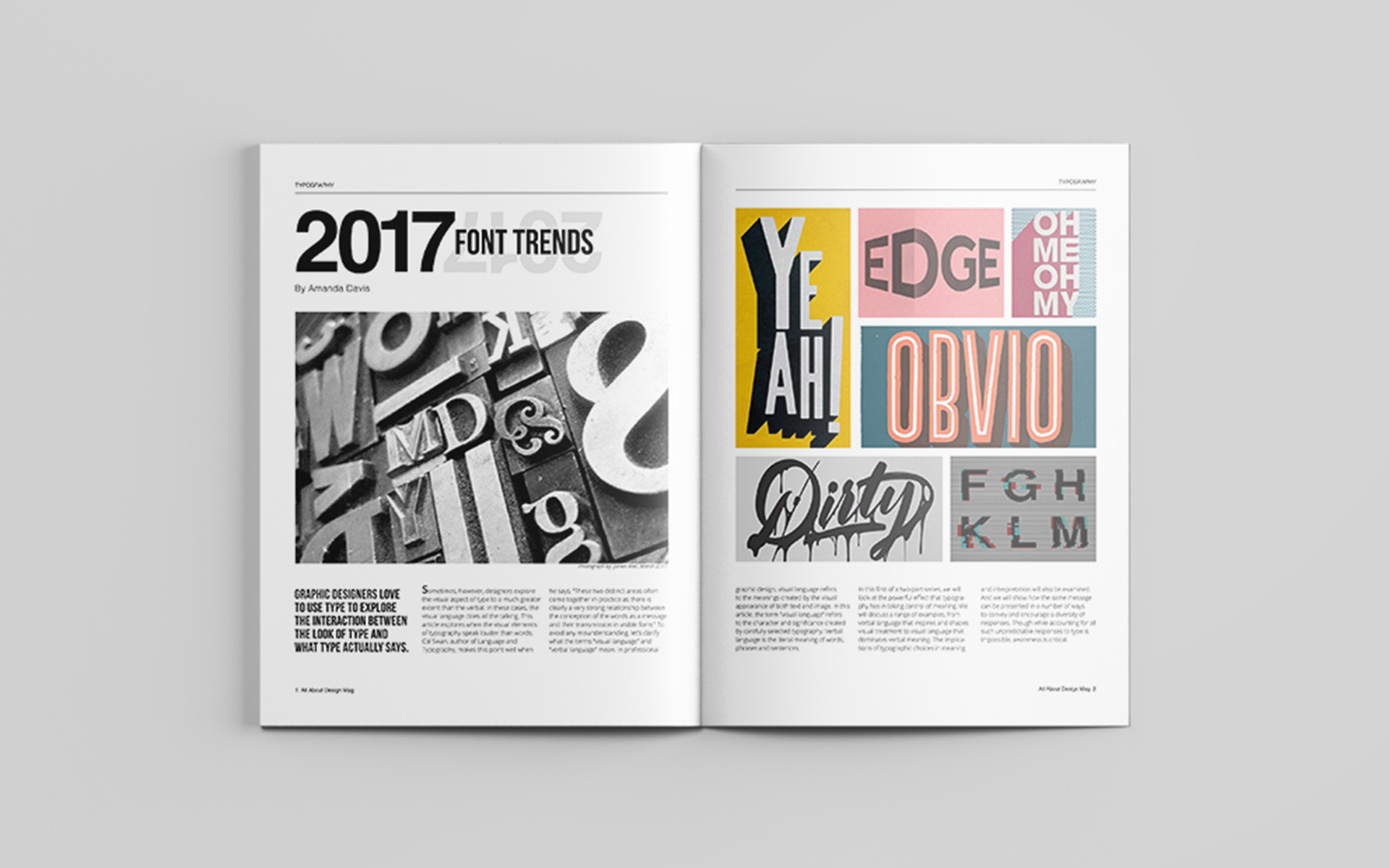
This project aimed to showcase the prominent font trends of 2017 through a visually compelling magazine spread. The challenge lay in effectively presenting a variety of typefaces while maintaining a cohesive and engaging design. The goal was to not just display the fonts, but to demonstrate their unique characteristics and potential applications within a dynamic layout. The project also explored how bold color choices and grid-based layouts could enhance the overall presentation of the chosen typefaces.
Process
My design process began with research into popular font trends of 2017, focusing on playful typefaces and their versatility. I curated a selection of fonts and explored how bold color palettes and clean grid layouts could best showcase them while creating hierarchy, movement, and visual interest. Using Adobe InDesign, I crafted the layout with careful attention to typography, spacing, and alignment, ensuring readability while balancing vibrancy with a clean, cohesive aesthetic.