Apex Sim Racing
Client
Apex Sim Racing
Year
2019
Role
Brand Identity
Task
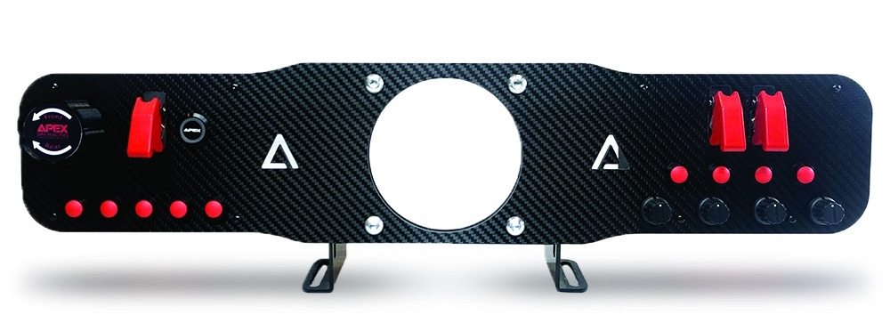
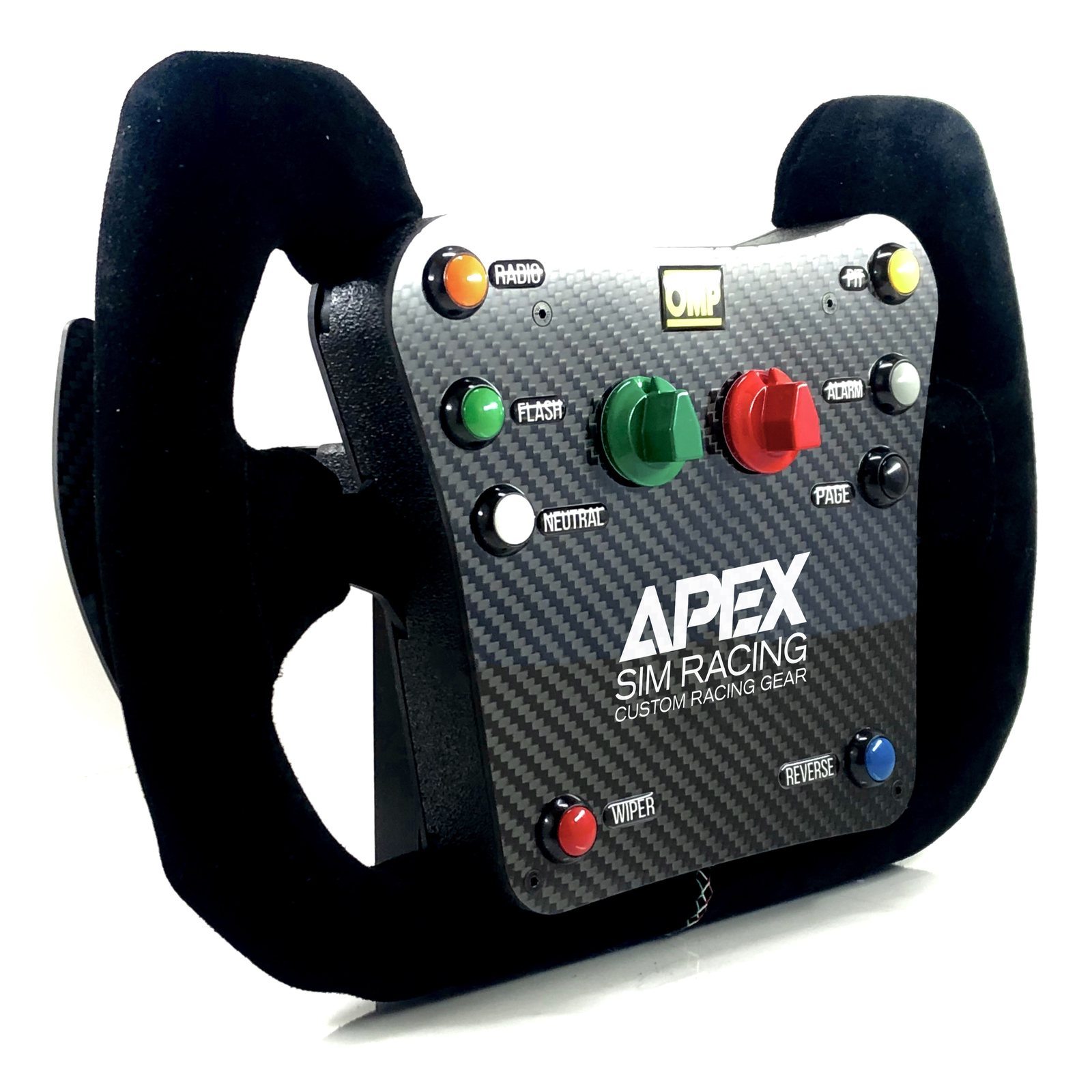
Logo design for a company that builds custom sim racing gear. A primary lockup, plus a reduced mark for applications too small to carry the full name.
Strategy & Process
The wordmark uses angled cuts through the letterforms to express speed without leaning on italics or a swoosh. The triangle monogram reduces the geometry to its simplest form for small-scale physical hardware applications.
Outcome
In active production across the company’s full product line of custom wheel faceplates and hardware button boxes.